Last week, a client building a luxury real estate site asked me: “How do I create a section on my homepage that shows properties by area, with images for each neighborhood?”
I pointed him to the Display Categories widget. Five minutes later, he had a grid of eight neighborhoods with custom images, each linking to filtered listings. No custom code. No extra plugins.
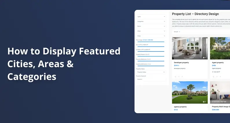
This widget is one of the most underused features in WPResidence. It lets you display any property taxonomy (cities, areas, categories, actions, counties, property status) as a visual grid on any page. Think “Browse by City,” “Top Neighborhoods,” or “Properties by Type” sections.
Here’s how to set it up, step by step.
Before You Touch the Widget: Assign Images to Your Taxonomies
This is the step everyone skips, and then they wonder why their category grid looks broken.
The Display Categories widget pulls images from your taxonomy items. If a category doesn’t have an image assigned, WPResidence shows the default theme thumbnail instead. That generic placeholder next to your carefully chosen neighborhood photos? Not a good look.
So before you add the widget to any page, go assign images to every taxonomy item you plan to display.
How to Assign Images to Categories
Here’s the process:
- Go to your WordPress admin panel.
- Navigate to Properties, Agents and More in the sidebar.
- Click Categories (or whichever taxonomy you want: Types, City, Area, County, State, Property Status).
- Click Edit on the category you want to update.
- Scroll down to the Media section.
- Press Upload Image.
- Select an image from your media library or upload a new one from your device.
- Click Insert into Post, then Update to save.
Repeat this for every category you want to show in the widget. Yes, it’s a bit tedious if you have 20+ categories. But you only do it once, and the result is worth it.
This works the same way for any taxonomy, not just categories. Want to display cities? Go to the City taxonomy, edit each city, and upload an image. Same for Area, County, State, or Property Status. The process is identical across all of them.
One tip: use images that are the same aspect ratio across all categories. Mixed sizes will make your grid look uneven. I usually go with 800×600 or 1200×800 for consistency.
Adding the Widget in Elementor
Once your images are in place, you can add the widget to any Elementor page.
- Open the page in Elementor (click Edit with Elementor).
- Search for the Display Categories widget in the Elementor panel.
- Drag and drop it into the section where you want it.
Now you’ll see the widget settings. Here’s what each option does:
Select Categories: Pick which taxonomy items to display. You can choose as many as you want. If you’re building a “Browse by City” section, select your cities. For “Property Types,” select your types. You’re not limited to one taxonomy either. Mix and match if it makes sense for your layout.
Number of Items Per Row: Controls how many categories show on each row. Set it to 4 and you get a clean four-column grid. Set it to 3 for larger cards. This depends on your page width and how many categories you’re displaying.
I usually go with 4 items per row for sections with 8+ categories, and 3 per row for 6 or fewer. But test it on your site. What works on a wide layout might look cramped on a boxed one.
The Four Design Types
This is where it gets interesting. The widget offers four different design styles, and they look very different from each other.
Design Type 1: The standard look. Large image cards with the category name overlaid. Clean, works for most sites. If you’re not sure which to pick, start here.
Design Type 2: A variation on Type 1 with a different overlay style. The layout shifts slightly, giving it a more modern feel. Good for sites that want something a bit less standard without going too far.
Design Type 3: Small thumbnails. This is compact and works well when you have a lot of categories to show in a tight space. I use this one for sidebar sections or when the category grid is secondary content, not the main hero section.
Design Type 4: Another layout variation with its own visual treatment. Test all four on your page and pick the one that fits your overall design.
There’s no “best” type. It depends on your site’s design language and how much space you’re giving this section. I’ve seen all four work well on different sites.
My suggestion: before you commit, drop the widget on a test page and click through all four types. It takes 30 seconds and you’ll immediately see which one fits. Don’t try to imagine it from the description alone.
Grid Mode vs Fixed Items Per Row
There’s an option called Display as Grid that changes how items are laid out.
Grid enabled: The number of items per row is calculated automatically based on screen size and a minimum width you set for each item. This makes the layout fully responsive without you having to think about breakpoints.
Grid disabled: You control the exact number of items per row. The widget respects your setting regardless of screen size (though it will still stack on mobile).
For most sites, I’d keep grid disabled and manually set items per row. It gives you more predictable results. Enable grid mode if you have a very dynamic layout or if you’re displaying a large number of categories and want the browser to figure out the best fit.
Styling Options
In the Style tab of the widget, you’ll find options to customize the appearance:
Item Size: This changes the image dimensions. Increase the value for larger cards, decrease for smaller ones. The images you uploaded will scale to fit, so make sure your originals are large enough to avoid blurriness at bigger sizes.
Border Radius: Adds rounded corners to the category cards. Set it to 0 for sharp edges, or bump it up for softer, rounded cards. A radius of 8-12px tends to look modern without going overboard.
Since this is an Elementor widget, you also get the standard Advanced tab with margin, padding, motion effects, and responsive visibility controls. Use these to fine-tune spacing between the widget and other sections on your page.
Using WPBakery Instead of Elementor
If you’re using WPBakery Page Builder instead of Elementor, the Display Categories widget is available there too. The settings are the same: select categories, choose items per row, pick a design type, and configure styling. The interface looks different (it’s WPBakery’s modal-based editor), but the output is identical.
The widget also works as a shortcode, so you can place it in any page content area regardless of which page builder you use.
Real-World Use Cases
Here are some ways I’ve seen people use this widget effectively:
“Browse Properties by City” on the homepage. Select your top 6-8 cities, use Design Type 1 with 4 per row, and you’ve got a visual navigation section that visitors actually click on. This alone can reduce bounce rates because people see their city and go straight to relevant listings.
“Property Types” in a sidebar or secondary section. Apartment, House, Villa, Commercial, Land. Use Design Type 3 (small thumbnails) for a compact display that doesn’t dominate the page.
“Featured Neighborhoods” on a landing page for a specific city. If you’re targeting “properties in Miami,” create a landing page and add a Display Categories widget showing Miami Beach, Brickell, Coral Gables, Wynwood, etc. Each one links to filtered results for that area.
The widget is flexible enough to serve different purposes depending on where you place it and which taxonomy you feed it.
Common Mistakes to Avoid
After years of support tickets, here are the three things that trip people up most:
- Forgetting to assign images. The widget works without images, but it looks terrible. Always assign images to your taxonomy items first. Don’t skip this step.
- Using mismatched image sizes. If one category has a 1920×1080 image and another has a 400×400 square, your grid will look inconsistent. Crop or resize your images to the same dimensions before uploading.
- Selecting too many categories for the row count. 12 categories in 4-per-row looks fine (3 rows). 12 categories in 2-per-row creates a wall of images that pushes everything else down the page. Match your row count to your total item count.
Get It Done
Here’s the quick version if you’re in a hurry:
- Assign images to all taxonomy items you want to display.
- Open your page in Elementor (or WPBakery).
- Add the Display Categories widget.
- Select your categories, set items per row, pick a design type.
- Adjust styling in the Style tab.
- Save and preview.
That’s it. You now have a visual category grid that helps visitors browse properties the way they actually want to: by location, by type, by whatever matters to them.
If this saved you time, share it with someone who’s still building their property pages from scratch. And if you run into something weird, drop a comment. I’ll take a look.
FAQ
Why is the WPResidence Display Categories widget showing a default placeholder image instead of my neighborhood photo?
The Display Categories widget pulls its images from the taxonomy term itself (for example: a specific City, Area, Category, or Property Status). If you have not assigned an image to that taxonomy item, WPResidence will fall back to the theme’s default thumbnail, which looks like a generic placeholder.
Fix it by editing each taxonomy item you plan to show and uploading an image in its Media section. Once the term has an image, the widget will use it automatically in the grid.
How do I assign images to Cities, Areas, Categories, or other property taxonomies before using the widget?
In your WordPress admin, go to the sidebar section for Properties, Agents and More, then open the taxonomy you want (Categories, Types, City, Area, County, State, or Property Status). Click Edit on a term, scroll to the Media section, click Upload Image, choose or upload the image, click Insert into Post, and then Update to save.
Repeat for every term you want to include in your Display Categories grid. The steps are the same across all supported taxonomies.
What image sizes work best so my category grid looks consistent?
Use images with the same aspect ratio for every taxonomy item you plan to display. Mixed aspect ratios and dramatically different sizes make the grid feel uneven because each card crops and scales differently.
A practical baseline is to standardize on something like 800×600 or 1200×800 for all category images so the Display Categories widget can render a clean, uniform grid.
How do I add the Display Categories widget to a page in Elementor, and what are the key settings?
Edit the page with Elementor, search for the Display Categories widget in the Elementor panel, and drag it into the section where you want the grid to appear.
The core settings to configure are: Select Categories (choose the taxonomy items you want shown), Number of Items Per Row (controls the column count), and the Design Type (one of four visual styles). After that, use the Style tab for options like Item Size and Border Radius, plus Elementor’s Advanced tab for spacing and responsive controls.
What is the difference between enabling “Display as Grid” and setting a fixed number of items per row?
With Display as Grid enabled, the widget calculates how many items fit per row automatically based on screen size and a minimum width you define for each item. This gives you a more fluid, responsive layout without manually managing breakpoints.
With Display as Grid disabled, you set a fixed Number of Items Per Row and the widget follows that structure more predictably (while still stacking appropriately on mobile). If you want consistent, controlled layouts, a fixed items-per-row setting is typically the more predictable choice.