Real estate website design is the process of planning, building, and optimizing a website to attract home buyers and sellers, display property listings, and generate agent inquiries. An effective real estate website combines IDX/MLS integration, mobile-first design, smart typography, and high-conversion lead capture into a single professional platform.
Buyers spend a median of 10 weeks searching and view a median of 7 homes (2 of those online only). And 88% still purchase through an agent. Your website’s job isn’t to close deals. It’s to start conversations. This guide gives agents and developers a data-backed blueprint for real estate website design, covering the features buyers expect, typography and color choices that build trust, layout patterns that drive engagement, and the platform decisions that shape cost and capability.
Why real estate website design directly affects your bottom line
You get one chance to make a first impression online. AltaStreet, citing Google’s Think with Google research, reports that 88% of consumers won’t return to a website after a bad experience, and 40% will switch to a competitor after a poor mobile experience. That’s not a design problem. That’s a revenue problem.
The conversion numbers tell the rest of the story. First Page Sage’s 2025 data pegs the real estate visitor-to-lead conversion benchmark at 2.2%. Agents with outdated or poorly structured sites often convert below 0.5%. The difference between 0.5% and 2.2% on 2,000 monthly visitors? That’s 34 more leads per month. At even a modest close rate, that’s real money.
Here’s something agents tend to overlook: 72% of homebuyers search on mobile, according to Digital Agency Network. So your design decisions are really mobile decisions. If your site doesn’t work beautifully on a phone screen, you’re invisible to nearly three quarters of your audience.
What do buyers actually want when they land on your site? NAR’s 2025 data breaks it down: photos (41%), detailed property information (39%), and floor plans (31%). Notice what’s not on that list? Flashy animations. Auto-playing music. Full-screen welcome mats. Buyers want information, presented clearly. Realtor website design isn’t a branding exercise. It’s a lead generation system. Every design choice should answer one question: does this make it easier for a visitor to find a property and contact an agent?
The 10 essential features every real estate website needs
A high-performing real estate website includes these 10 features:
- IDX/MLS property search
- Mobile-first design
- High-quality photography
- Video and virtual tours
- Interactive map-based search
- Advanced search filters with progressive disclosure
- Lead capture tools
- Neighborhood data and local content
- Social proof
- Home valuation tool for seller lead capture
1. IDX/MLS property search. This is the single most important feature. IDX (Internet Data Exchange) pulls live MLS listing data onto your website so visitors can search active listings without leaving your site. There are two types: iFrame IDX (fast to set up, but listings aren’t indexed by Google) and native/organic IDX (listing pages become real indexed content, compounding your SEO over time). The distinction between these two approaches matters enormously for long-term traffic. More on that in the WordPress section below.
2. Mobile-first design. With 72% of real estate searches happening on mobile devices, mobile-first design means building for the small screen first, then scaling up. This isn’t the same as “responsive,” which typically means shrinking a desktop layout. Google uses mobile-first indexing, so the mobile version of your site determines your search rankings.
3. High-quality photography. REsimpli reports that homes with professional photos sell 32% faster. In practice, this means a minimum of 20 photos per listing, a full-screen lightbox gallery, and optimized file sizes so images load fast.
4. Video and virtual tours. Property listings with video receive 403% more inquiries, according to REsimpli (a widely cited figure attributed to NAR research). 3D virtual tours receive 87% more views than listings without them. At minimum, you want an embedded walkthrough video on each listing page.
5. Interactive map-based search. This lets users draw boundaries and search within a specific area. Touch-enabled map search is non-negotiable for mobile users. If you’ve ever tried to pinch-zoom a static map on your phone to find a property, you understand why.
6. Advanced search filters with progressive disclosure. Show core filters (price, bedrooms, location, property type) by default. Reveal advanced filters (lot size, year built, HOA fees) only on request. Too many filters at once causes decision paralysis. NAR’s buyer data confirms that photos (41%) and detailed property info (39%) are what buyers value most, so don’t let a filter wall block them from the visual experience they came for.
7. Lead capture tools. Saved searches, property alerts, and contact forms that require minimal fields. Here’s a stat that should change how you think about follow-up: responding within 5 minutes yields 391% better conversion than delayed response, according to Growform (a single-source figure, but widely cited in the industry). Your CTA should be above the fold on every page.
8. Neighborhood data and local content. Walkability scores, school ratings, commute times. Walk Score’s research found that each point of Walk Score adds approximately $3,250 in home value. Over 72% of buyer searches reference a specific address or named neighborhood, not just a city. Local content wins local searches.
9. Social proof. Testimonials, recent sales counts, and third-party review widgets from Google, Zillow, or Realtor.com. Place these on the homepage hero section and individual agent bio pages, not buried in a “Reviews” tab no one clicks.
10. Home valuation tool (seller lead capture). An instant CMA (comparative market analysis) tool is the highest-converting mechanism for capturing seller leads. Most real estate websites focus exclusively on buyer search. Adding a visually prominent home value estimator on the homepage opens an entirely separate lead channel.
Mobile-first design and page speed: the performance foundation
Let’s be direct about numbers: 72-74% of all real estate website traffic comes from mobile devices. For any real estate website design project, this isn’t a trend. It’s the primary use case. If you’re designing for desktop first, you’re optimizing for the minority.

Google uses mobile-first indexing, which means the mobile version of your page determines your search rankings. If the mobile experience is slow or broken, rankings drop regardless of how polished the desktop version looks.
What does good mobile design actually require? Touch targets at minimum 44×44 pixels (so fingers can actually tap buttons), font sizes at minimum 16px, tap-to-call phone numbers, and a map search that works on touchscreens. These aren’t suggestions. They’re baseline requirements.
Then there’s speed. Google measures three metrics called Core Web Vitals that every real estate site owner should know:
- LCP (Largest Contentful Paint): target under 2.5 seconds. This is usually the hero image or the first listing photo. If your high-resolution property photos aren’t compressed, this metric will fail.
- INP (Interaction to Next Paint): target under 200ms. This matters when visitors use search filters or pan across an interactive map.
- CLS (Cumulative Layout Shift): target under 0.1. Images loading without reserved space cause page elements to jump. Bad for listing grids where users are trying to click on a specific property card.
Why does any of this matter commercially? A NitroPack study found that a 100ms improvement in load time can improve conversions by 7-10%. And 53% of mobile users leave a page that takes more than 3 seconds to load.
The practical fix list is short: compress and lazy-load listing images, use a CDN, minimize third-party scripts (chat widgets, map embeds add weight), and choose a theme that includes built-in caching and asset compression. Theme selection, covered below, is where most of this gets decided.
Property listing page design: where conversions actually happen
Most real estate website design guides focus on the homepage. That’s a mistake. The listing detail page is where buying decisions actually form. Buyers navigate there from search results and evaluate whether to pick up the phone. Everything you do on the homepage is just a path to get them here.
Here’s what a high-converting property listing page looks like, top to bottom:
Photo gallery: Minimum 20 photos, full-screen lightbox capability, ordered intentionally (exterior first, then living areas, kitchen, bedrooms, bathrooms, outdoor space, neighborhood). Your first photo is the hero. Choose the best exterior shot, not the one the photographer happened to take first.
Video and 3D tour embed: Placed immediately below or alongside the photo gallery. Not buried at the bottom of the page where no one scrolls.
Key facts bar: Price, bedrooms, bathrooms, square footage, lot size, listed date. This bar should be scannable at a glance and visible above the fold on mobile. If a buyer has to scroll past a paragraph of marketing copy to find the price, you’ve already lost them.
Description: 150-250 words. The first two sentences must include the location and the property’s primary selling point, because Google indexes this text. Avoid phrases like “beautiful home” and “must see.” They communicate nothing. “1,200 sq ft renovated bungalow in Oak Park, three blocks from the Blue Line” communicates everything.
Floor plan: Static image or interactive. NAR data shows floor plans are the third most valued content type at 31%. If you have them and aren’t displaying them prominently, you’re leaving engagement on the table.
Contact/inquiry CTA: Sticky sidebar on desktop, sticky bottom bar on mobile. One primary CTA: “Schedule a Showing” or “Request Info.” Don’t split attention with three different buttons competing on the same screen.
Neighborhood context module: Walk Score widget, school rating widget, map showing nearby amenities. This supports the $3,250-per-Walk-Score-point value that Walk Score’s research documented.
Agent profile snippet: Name, photo, license number, phone, email. This builds trust. Remember: 88% of buyers close through an agent. Your listing page should make contacting that agent effortless.
Quinn Residences shows what’s possible at the more ambitious end. Their site features a clickable community site map that overlays real streets with real-time unit availability, combined with drone footage, 360-degree tours, and a “Living by Quinn” editorial magazine blending resident spotlights and neighborhood storytelling. That level of production isn’t required for every agent. But the structural principle applies across the market: blend transactional property search with immersive lifestyle content.
One misconception worth correcting: “more photos = better” isn’t true. Quality and sequence matter more than quantity. AltaStreet reports that drone photography boosts engagement 83% and helps properties sell 68% faster. A few excellent aerial shots beat 40 blurry phone photos every time.
Typography: font choices and hierarchy for real estate sites
Font choice is one of those design decisions that looks invisible when it’s done well. Pick the wrong typeface and your site reads as cheap or illegible. Pick the right one and buyers stay longer, read more, and trust the brand. That’s not an accident. It’s psychology.
Real estate sites favor clean, legible fonts. Common sans-serifs include Arial/Helvetica (web-safe fallbacks) and Google Fonts like Roboto, Open Sans, Lato, and Montserrat. These convey professionalism and clarity at any screen size. For luxury positioning, serif headlines like Playfair Display or Lora add elegance without sacrificing readability. Overly ornate script fonts don’t belong anywhere near a search form or a price tag.
Keep your font palette at two typefaces maximum: one for headings, one for body text. Three fonts is a stretch. Four is visual noise. The heading font should create contrast with the body font, either through weight, style (serif vs. sans-serif), or both.
Font hierarchy and sizing
A clear size scale ensures buyers can scan a listing page without conscious effort. Here’s a practical system:
- H1 (hero/page title): 32-36px, bold weight
- H2 (section titles): 24-30px, semi-bold
- H3 (subsection headings): 20-24px, medium weight
- Body text: 16-18px, normal weight
- CTAs and price display: 18-20px, bold (draw the eye to the action)
Responsive sizing matters. Use rem or vw units rather than fixed pixels so text scales smoothly across device sizes. Set line-height to 1.4-1.6x the font size for body paragraphs. That range keeps text from feeling cramped on mobile or floaty on desktop.
Always include a web-safe fallback stack in your CSS. If the Google Font fails to load, you want a reasonable default, not invisible text:
font-family: 'Open Sans', Helvetica, Arial, sans-serif;Font pairing examples with CSS
Here are three ready-to-use pairings. Each one is available free through Google Fonts.
Montserrat + Open Sans (clean and modern, works for most agent and brokerage sites):
@import url('https://fonts.googleapis.com/css2?family=Montserrat:wght@600;400&family=Open+Sans:wght@400;700&display=swap');

h1, h2, .header { font-family: 'Montserrat', sans-serif; font-weight: 600; }
body, p, .btn, input { font-family: 'Open Sans', sans-serif; font-weight: 400; }
Playfair Display + Roboto (luxury positioning, serif headline adds gravitas):
@import url('https://fonts.googleapis.com/css2?family=Playfair+Display:wght@700&family=Roboto:wght@400;500&display=swap');

h1, h2, .headline { font-family: 'Playfair Display', serif; font-weight: 700; }
body, p, .btn, .listing-info { font-family: 'Roboto', sans-serif; font-weight: 400; }
Poppins + Lora (contemporary bold headings with a readable serif body, good for boutique agencies):
@import url('https://fonts.googleapis.com/css2?family=Poppins:wght@600;400&family=Lora:wght@400;700&display=swap');

h1, h2, .nav, .cta { font-family: 'Poppins', sans-serif; font-weight: 600; }
body, p, .description { font-family: 'Lora', serif; font-weight: 400; }
Each of these pairings creates clear hierarchy between heading and body. The CSS is copy-pasteable into any WordPress theme’s custom stylesheet. Just swap in your own size values from the hierarchy table above.
Color palettes and branding for real estate websites
Color communicates before words do. A visitor forms a subconscious judgment about a real estate brand in milliseconds, and color drives most of that reaction. The good news: the psychology here is well-documented and not complicated.
Blues and navy tones signal trust, stability, and professionalism. That’s why so many established brokerages use them. Greens suggest growth and nature, which works well for suburban or eco-conscious brands. Gold and champagne accents read as luxury. Earth tones (taupe, warm beige, terracotta) convey warmth and approachability. Neutral grays and whites provide the clean backdrop that keeps listings, not the chrome, as the visual focus.
A useful starting framework is the 60/30/10 rule: 60% dominant color (primary backgrounds, nav), 30% secondary (highlights, cards, section breaks), 10% accent (CTAs, links, icons, price tags). This ratio prevents visual overload while giving your brand a distinct identity.
Accessibility is non-negotiable. WCAG AA requires a minimum contrast ratio of 4.5:1 for body text against its background. Dark charcoal on white easily clears this threshold. Light gray on white does not. Run your palette through a contrast checker before committing to it.
Sample palettes with CSS variables
Here are four palettes with HEX codes and CSS custom properties ready to paste into your stylesheet:
Trustworthy Navy (professional brokerages, urban markets):
:root {
  --primary-color: #0D2A4A;    /* deep navy — buttons, headers */
  --secondary-color: #77B6EA;  /* sky blue — backgrounds, highlights */
  --accent-color: #00A3A3;     /* teal — CTAs, links, icons */
  --light-bg: #E6E9ED;         /* cool gray — page background */
  --dark-text: #2F2F2F;        /* near-black — main body text */
}
Coastal Teal (beachside, resort, or vacation rental markets):
:root {
  --primary-color: #0E6B65;    /* deep teal */
  --secondary-color: #8FD6C2;  /* seafoam mint */
  --accent-color: #FF6F61;     /* coral — warm CTA pop */
  --light-bg: #E7D8C9;         /* sand */
  --dark-text: #4B5563;        /* slate gray */
}
Luxury Black-and-Gold (high-end condos, prestige developments):
:root {
  --primary-color: #000000;    /* black */
  --secondary-color: #3C3C3C;  /* graphite */
  --accent-color: #C5A880;     /* champagne gold */
  --light-bg: #FAFAFA;         /* soft white */
  --dark-text: #000000;
}
Eco Green (sustainable housing, suburban family markets):
:root {
  --primary-color: #184A45;    /* forest green */
  --secondary-color: #A3B18A;  /* sage */
  --accent-color: #C6A15B;     /* brass/gold */
  --light-bg: #F7F3ED;         /* warm off-white */
  --dark-text: #6E6E6E;        /* medium gray */
}
Each palette assigns a role to every color. Don’t just grab a HEX you like. Define which color handles headings, which handles CTAs, which handles card backgrounds. Consistency across every page is what makes a brand feel intentional rather than assembled.
Layout patterns, imagery, and interactive elements
Visitors scan real estate sites the way they scan listings: fast, non-linear, looking for the one detail that catches attention. Your layout needs to support that behavior, not fight it.
Grid and card layouts
The responsive card grid is the standard for listing results, and for good reason. Each card contains a cropped property photo (landscape 16:9 or square), key details below (price, beds, baths, sqft), and a hover state that may reveal an alternate image or quick action buttons like “Save” or “Contact Agent.” On desktop, grids run 3-4 columns. On mobile, they collapse to a single column. The pattern is so familiar that buyers don’t have to think about it.
For luxury developments and boutique agencies, split-screen layouts (full-bleed image left, text and CTA right) create more visual drama. Magazine-style asymmetric grids show up on editorial sections. Both work, but they need stronger photography to carry the weight.
Hero sections
Most successful real estate sites open with a full-bleed hero: a large, high-quality property or lifestyle photo (or a muted autoplay video) behind a bold headline and search form. The search bar is the single most important element in the hero, because the buyer’s first instinct is “can I search for a home right now?” Place it centrally in the hero or fix it to a sticky header so it’s always reachable on scroll.
Video backgrounds work well for luxury and developer sites where the goal is mood-setting before the buyer digs into listings. Keep videos muted, looping, and under 10MB. If it slows the page, it’s already costing you conversions.
Navigation patterns
Sticky headers mean the menu and primary CTA stay accessible as buyers scroll through a long listing page. Off-canvas (hamburger) menus conserve screen real estate on mobile without sacrificing navigation depth. Breadcrumbs help buyers understand where they are in a listing hierarchy and reduce the back-button drop-off that kills sessions.
Imagery
Hero images should be professional photography, not stock. Real local scenes and actual agent photos build trust in a way that generic library photos can’t. In property galleries, maintain consistent crop ratios. In agent bio sections, use professional headshots with consistent framing and lighting across the team.
Interactive elements and animations
Subtle animations improve engagement without slowing the experience. The pattern that works: hover effects on listing cards (slight scale or drop shadow), smooth scroll between sections, scroll-triggered fade-ins for content blocks. Parallax backgrounds (image scrolls slower than the page) add depth to hero sections and developer microsites.
All animations should complete in under 300ms. Longer and they feel sluggish. For implementation, use CSS transition and transform properties rather than JavaScript-heavy libraries for simple effects. For complex scroll animations like those on the Richland Dubai site, GSAP handles the heavy lifting without thrashing the main thread.
What to avoid: infinite looping animations, GIFs in listing galleries, and autoplay video with sound. These irritate buyers and tank performance scores simultaneously.
10 real estate websites that get design right
Theory is fine. Real sites are better. Here are eight current examples that demonstrate the design patterns above in practice, followed by a comparison table.
The Coloradan (Denver, CO)is a luxury condo microsite built on Squarespace. The hero opens with a full-screen lifestyle photo, white text overlay, and minimal navigation (just a logo and menu icon). Below the fold, a two-column grid emphasizes the building and neighborhood with a serif headline on white. The palette is navy, white, and gold. Elegant, high-contrast, and completely focused on the property.
City Sales (Auckland, NZ) leads with a rotating hero slider of home interiors and a search widget front-and-center with price and bedroom filters layered over the image. The sticky header stays visible throughout. Bright cyan accents on white and gray keep it friendly without veering into corporate. The search-first approach mirrors exactly what buyers want to do the moment they arrive.
Tbilisi Gardens (Tbilisi, Georgia)is a high-end development microsite that opens with layered parallax images of the building and surrounding forest. Navigation hides behind an off-canvas menu. The palette is dark navy and charcoal with gold accents, and a refined serif handles all headlines. Sections slide into view on scroll. The whole site reads like architecture photography, not a property listing.
PropertyClub (NYC)is a large React-based rental portal. The hero features a bold background image and a full-width search bar. Below, featured rentals appear in a clean card grid. The navy and gold brand colors hold consistency across thousands of listing pages. The site demonstrates how card grids and search-first design scale to portal level.
Di Jones (Sydney, Australia) uses an animated abstract hero behind a search form, with bright orange CTAs against white sections. Content blocks appear with subtle fade-ins on scroll. Typography is Open Sans for body, Montserrat for headings: the same pairing from the font section above, in production at scale on a major agency site.
Richland Dubai takes animation further than most. The homepage uses GSAP-powered scroll animations with full-screen sections, cool blue tones, and heavy white space. Projects appear in card sliders with smooth transitions. The result is crisp and contemporary. The tradeoff is build complexity, but the performance stays clean because the animations use hardware-accelerated CSS transforms.
Akershus Eiendom (Norway) sits at the opposite end of the spectrum: strict minimalism. White background, charcoal text, a static full-bleed hero image, and a visible search filter by location and price. No animations. No gradients. The typography does most of the work. It’s a reminder that restraint can be a design choice, not a limitation.
Comparison table
| Site | Fonts | Colors | Layout notes | Visual notes |
|---|---|---|---|---|
| The Coloradan | Playfair Display / sans body | Navy / White / Gold | Full-width hero, two-column grid | Elegant serif headline on white; luxury tone |
| City Sales | Sans-serif / sans-serif | White / Bright Cyan | Hero slider with search overlay, sticky nav | Friendly accent; search-first layout |
| Tbilisi Gardens | Serif headline / sans body | Dark Navy / Charcoal / Gold | Off-canvas menu, parallax sections | Cinematic layered imagery; golden accents |
| PropertyClub NYC | Montserrat / sans-serif | Navy / Orange Accent | Hero search bar, card grid listings | Strong search focus; consistent branding at scale |
| Level Barvikha | Sans-serif light / sans-serif | Monochrome / Pastel Blue | Video background hero, split-screen panels | Cinematic scroll; smooth transitions |
| Di Jones | Montserrat / Open Sans | White / Orange Accent | Animated hero, inline search filters | Bright CTAs; progressive fade-in reveals |
| Richland Dubai | Sans-serif / sans-serif | White / Light Blue | GSAP scroll animations, full-screen sections | Crisp and minimal; smooth hardware-accelerated motion |
| Akershus Eiendom | Sans-serif / sans-serif | White / Charcoal | Static hero, simple search filters | Strict minimalism; typography-driven |
What these sites share: professional photography that carries visual weight, a dominant search experience (either in the hero or a sticky header), consistent color systems applied across every page, and typography that creates hierarchy without decoration for its own sake. None of them try to do everything at once.
Platform choices: WordPress, SaaS, or custom?
So what’s the best platform for real estate website design? It depends entirely on your situation. Here are the three paths:
Website builders (Wix, Squarespace) cost $15-$50/month. You can launch fast with a template, but IDX options are limited or require third-party add-ons that never quite integrate properly. Best for agents who list on Zillow and MLS, and use the website primarily for credibility and contact.
Specialized real estate SaaS (Luxury Presence, Real Estate Designer, Agent Image) cost $99-$500+/month. Purpose-built for real estate workflows with IDX included. White-glove setup, but limited customization. Best for high-volume teams and luxury brokerages that want hands-off managed service.
WordPress (self-hosted) offers maximum flexibility, full ownership, and a rich plugin/theme ecosystem with native IDX integration possible. Initial cost is a one-time theme purchase plus monthly hosting and IDX plugin subscription. Best for agents who want to own their digital asset and build compounding SEO value over time.
| Platform type | Example platforms | Setup cost | Monthly cost | IDX included | SEO control | Customization | Best for |
|---|---|---|---|---|---|---|---|
| DIY website builder | Wix, Squarespace | $0-$300 | $15-$50 | Limited/add-on | Limited | Template-based | Agents who don’t need IDX |
| WordPress + premium theme | WPResidence + hosting | $79-$300 | $20-$80 (hosting + IDX) | Native IDX possible | Full control | Extensive | Independent agents, small agencies |
| Specialized RE platform | Luxury Presence, Real Estate Designer | $0-$2,000 setup | $99-$500 | Included | Partial | Limited | High-volume teams, luxury brokerages |
| Custom development | Agency-built | $25,000-$100,000+ | $100-$500+ | Custom | Full control | Unlimited | Large brokerages, portals |
One important caveat: WordPress can hit scaling limits with very large MLS databases, and enterprise portals with tens of thousands of listings may need custom solutions. For most independent agents and small-to-mid-size brokerages, though, WordPress powers 43% of all websites globally and dominates this market segment for good reason.
For agents choosing WordPress, the theme and plugin selection determines 80% of the site’s capability. The next section covers that ecosystem in detail.
The WordPress ecosystem for real estate websites
Why WordPress dominates real estate web design
WordPress’s open-source architecture means no vendor lock-in. You own your content, your domain, and your database. The theme-plus-plugin model separates visual design from functionality, so you can change how your site looks without rebuilding its core features. And because WordPress supports native IDX integration, listing pages become real indexed content on your domain, not embedded windows into someone else’s platform.
Choosing a real estate WordPress theme
Your theme determines the visual experience, search functionality, listing management, and often the IDX integration method. When evaluating themes, look at native IDX support versus plugin dependency, Core Web Vitals performance, page builder compatibility, support quality, and how frequently the theme gets updates.
WPResidence is a professional WordPress real estate theme built for agents and agencies where MLS integration is central to the business. ThemezHub reviewer Shaurya Preet’s independent comparison positioned it as the most capable option in the WordPress ecosystem for agencies managing large property portfolios with MLS feeds.
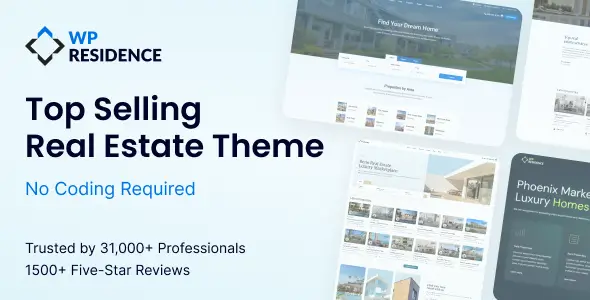
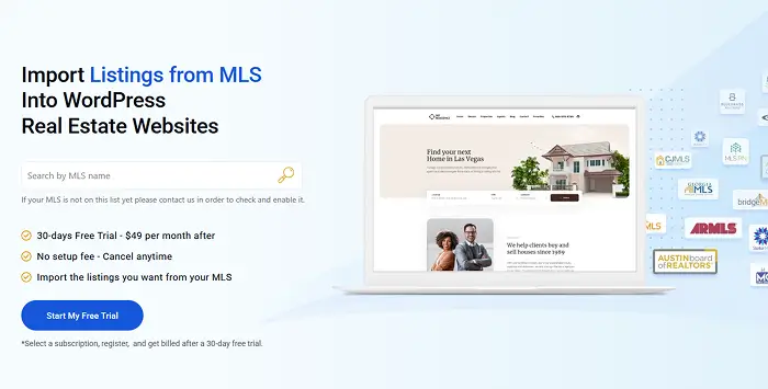
Pricing sits at approximately $79 one-time for a ThemeForest regular license. Pair it with an MLS Import plugin subscription and managed hosting, and you’re running a fully professional real estate website for a fraction of what custom development costs.
Support quality matters with WordPress themes (anyone who’s been left hanging by a theme developer for weeks knows this). One WPResidence customer, YungKhang, wrote in a ThemeForest review: “Their support is always swift, very often Anna or Roxana will reply on the same day.” That kind of response time is rare in the WordPress theme market.
Real-world MLS setup tells a similar story. Christina Catalano, a broker, described her experience working with the MLS Import team: “The MLS Import team was absolutely amazing in working with me to install and set up the plugin, give me tips about creating the import searches, and trouble shoot any issues I had.” For agents nervous about the technical side of IDX setup, that kind of hands-on support changes the equation.
For the developer audience: WPResidence requires PHP 8.0+, WordPress 6.7+, and 512MB memory. The one-click demo import makes client site deployments fast, and the Elementor integration means clients can manage content after handoff.
Two alternatives worth knowing about: Houzez leads ThemeForest in total sales with approximately 41,000 purchases and 2,000+ reviews, and is a solid choice for agents who want broad community support and general-purpose real estate functionality. RealHomes stands out for its clean design and WPML multilingual support, making it a strong pick for international real estate sites.
IDX plugins for WordPress: iFrame vs. native integration
This is the most important technical decision for a WordPress real estate site. The two approaches produce completely different SEO outcomes.
iFrame IDX: A third-party search tool embedded in a box on your page. You can set it up in hours. But listings are not indexed by Google because the iFrame is a window into another website. Your theme can’t style it consistently. Your visitors notice the visual disconnect.
Native/organic IDX (RESO Web API): Listing data gets pulled into your WordPress database as actual posts. Google indexes each listing page. Your theme styles them consistently. Every new listing becomes a new indexed page on your domain. SEO compounds over time.
The consequence is stark: an iFrame IDX site has zero indexed listing pages. An organic IDX site can have thousands, each one a potential Google entry point for a buyer searching “[neighborhood] 3 bedroom house.”
Plugin options and approximate pricing: MLS Import (subscription, pairs with WPResidence), Showcase IDX (~$75/month), iHomefinder (~$50-$100/month), Realtyna WPL ($199 one-time with organic integration). Luxury Presence refreshes MLS data every 3 minutes as a benchmark; most providers sync hourly.
Lead generation design patterns that convert visitors to inquiries
Your real estate website design can attract 10,000 visitors a month and still produce zero revenue if nobody fills out a form. Design and lead generation are the same problem.
Start with the response benchmark: responding to a lead within 5 minutes yields 391% better conversion compared to delayed response, according to Growform. That means your lead capture system must connect to a CRM that triggers immediate follow-up, not a Gmail inbox you check twice a day.
CTA placement rules: Primary CTA above the fold on every page. On property pages, sticky sidebar CTA on desktop and sticky bottom bar on mobile. One CTA per page. Don’t compete with yourself by showing “Schedule a Showing,” “Contact Agent,” and “Download Info” all on the same screen.
Form optimization: Fewer fields means higher completion rates. Start with email only. Collect additional information through your CRM follow-up sequence. Progressive profiling (asking one additional question per subsequent interaction) respects the buyer’s time while building your contact record gradually.
Gated features for lead capture: Saved searches, price change alerts, and property favorites all require registration. This is the ethical trade: buyers get something genuinely useful (automated notifications when a matching property hits the market), and you get their contact information. They opt in because they want to, not because you tricked them.
Social proof architecture: Place testimonials on the homepage and agent bio pages, near CTA buttons. Prioritize video testimonials over text (they’re more credible). Embed third-party review widgets from Google, Zillow, or Realtor.com rather than hand-curated quotes. Readers trust external platforms more than cherry-picked praise you selected yourself.
Seller lead capture: A CMA (comparative market analysis) tool or instant home value estimator belongs in a visually prominent position on the homepage, separate from the buyer search. This is the highest-converting lead capture mechanism for seller leads, and most real estate sites ignore it entirely.
CRM integration: Lead capture without CRM integration is a leaky funnel. When a visitor submits a form or registers for saved searches, that data must flow immediately into a CRM (Follow Up Boss, KvCORE, HubSpot). The CRM triggers the follow-up sequence: ideally an automated text within 1 minute, followed by a personal call. In practice, most agents treat CRM integration as an afterthought. It should be a non-negotiable technical requirement during the build, not something you bolt on three months later.
ADA accessibility and WCAG compliance: the legal and conversion case
Here’s a fact that reframes how you should think about real estate website design: the average home seller is 63 years old, based on NAR data. Accessibility isn’t a niche accommodation for a small population. It’s designing for your primary customer. Larger fonts, sufficient color contrast, and keyboard navigation serve this demographic directly.
The legal exposure is real, too. Real estate websites are increasingly subject to ADA (Americans with Disabilities Act) Title III compliance scrutiny. Brokerages with property search tools that can’t be navigated by keyboard, map interfaces without text alternatives, and contact forms without labeled fields are all exposure points.
The practical standard is WCAG 2.1 Level AA, organized around four principles:
- Perceivable: All images have alt text (this also benefits SEO). Color isn’t the only way to convey information. Map pins use both color and shape to distinguish property types.
- Operable: All interactive elements (search filters, map controls, contact forms) work with a keyboard and are touch-accessible.
- Understandable: Form labels are explicit. Error messages are clear. Property descriptions avoid jargon without context.
- Robust: The site renders correctly in assistive technology like screen readers. This requires semantic HTML in the theme’s code.
Premium WordPress themes like WPResidence use semantic HTML by default. For additional compliance needs, accessibility plugins (WP Accessibility, for example) handle ARIA label injection and skip-link functionality.
Where do you start? Run a free WAVE Web Accessibility Evaluation scan on your site. Fix high-severity issues first. You don’t need to be perfect on day one, but you do need to be moving in the right direction.
The decisions that define real estate website design (platform choice, IDX integration, typography, color, page speed, and local content) compound over time. A site built on the right foundation today generates more traffic, more leads, and more closings a year from now than it does this month. That’s the whole point. You’re not building a brochure. You’re building a system.
The conversion gap is real: 96% of buyers start their search online, but most real estate websites convert under 2.2% of that traffic. The design decisions covered in this guide (IDX setup, mobile performance, font hierarchy, color contrast, card layouts, and CTA placement) are what close that gap. None of them are magic fixes. They’re the compounding effect of getting platform, content, and execution right simultaneously.
For most independent agents and small brokerages, WordPress with a well-chosen theme and native IDX integration provides the best balance of cost, capability, and SEO control. You own the asset, control the content, and build equity in your domain over time, rather than renting visibility on someone else’s platform.
If you’re evaluating the WordPress path, WPResidence offers a live demo environment where you can see IDX search, listing pages, and all the search features in action before committing. The real estate website design best practices covered here don’t require six figures or six months. They require the right foundation and the discipline to maintain it.