What Should a Property Listing Page Include?
Last updated: May 22, 2026
Are you building a property listing page and not sure what it needs, or why the order matters? Good property website design follows six blocks in a fixed sequence: hero gallery, key facts strip, property description, floor plan, neighborhood map, and contact-agent form.
That order is not arbitrary. It mirrors how a buyer decides, moving from emotion (the photos that pull them in) to qualification (the price, specs, and layout that tell them whether it fits) to commitment (the inquiry that hands their details to an agent). Scramble the order and you lose the buyer in the middle.
Solid real estate website design converges on a single property page built in this sequence. This guide walks through all six blocks one at a time: what each does, the research behind it, and how to set it up in a WordPress real estate theme like WPResidence.
Disclosure: WPResidence publishes this guide, and several sources cited here (including CubiCasa, Virtuance, and RoomSketcher) sell floor-plan and real-estate visual-marketing products.
What Goes on a Property Listing Page?
NAR’s 2024 Profile of Home Buyers and Sellers found photos (41%), detailed property information (39%), and floor plans (31%) are the features buyers value most on real estate websites. Those three map onto the first three blocks:
- Hero gallery: the first impression; photos are the website content buyers value most (NAR 2024 Profile of Home Buyers and Sellers).
- Key facts strip: price, beds, baths, square footage, and status; it answers “does this fit my budget?” before the buyer scrolls.
- Property description: 150 to 250 words of features-and-benefits copy; the emotional narrative behind the numbers.
- Floor plan: the spatial layout; 82% of buyers believe the real estate industry should require a floor plan on every listing (WAV Group, August 2025).
- Neighborhood map: an embedded interactive map with points of interest; location is the most-weighted search factor.
- Contact-agent form: the conversion event; sticky on desktop, a floating bottom bar on mobile.
The list is the page’s vertical order, but blocks 1 and 2 share the first viewport: the gallery dominates it, with price and core stats alongside or beneath, so the buyer sees both without scrolling.
The key facts strip is the quiet workhorse here. It shows price, beds, baths, square footage, and listing status, and WPResidence renders it automatically from the property fields you fill in.
When you pick a property website template, check it supports all six blocks natively. Each section below breaks one block down.
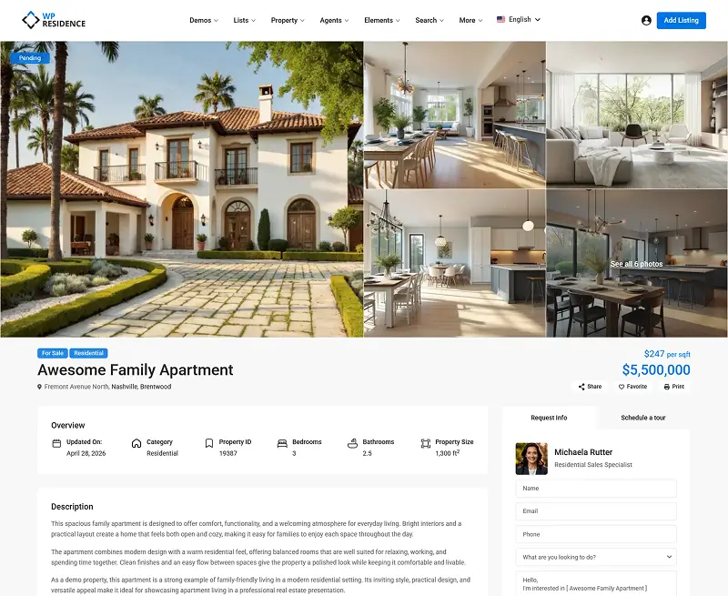
The Hero Gallery: Photos First, Always
Getting the hero gallery right is the single biggest win in property website design. Photos are the listing feature buyers lean on most, so the gallery has to be generous, but it can’t bury the price and the call to action.
Kathryn Whitenton, a UX researcher at the Nielsen Norman Group, puts it plainly: “Large images are visually appealing, but they can harm the overall user experience if they aren’t appropriately prioritized.” So surface the price and key facts alongside the gallery.
Photo count has a sweet spot. Zillow research published in 2019, analyzing 2014-2015 listing data, found homes with 22 to 27 photos were most likely to sell within 60 days. Homes with fewer than nine photos were about 20% less likely to, and homes with 28 or more, which tend to be priced higher, sold more slowly.
The lead image matters too. Professional photography earns up to 61% more views (NAR data), and a twilight hero shot can draw 76% more (per Square Foot Photography, a single-source figure best read as directional).
Three gallery formats cover almost every listing. The fullbleed slider shows one large image with arrow navigation for maximum impact, used by Zillow and Redfin for residential homes. The grid mosaic pairs one large image with two to four thumbnails, which suits vacation rentals.
The thumbnail strip keeps a single hero image with a scrollable row underneath. For luxury real estate websites, the fullbleed slider with a dark overlay and minimal text creates the premium look buyers expect.
A virtual tour belongs inside or just below the gallery block. Listings with 3D tours are reported to close up to 31% faster and sell for up to 9% more, a figure widely cited across virtual-tour platforms but best read as directional. In WPResidence, you add the tour link on the property page edit screen.
To set it up in WPResidence, open your property edit screen and scroll to the Gallery module. You’ll see a media uploader where you set the slider type, image count, and autoplay speed. Don’t worry about the technical side: WPResidence handles WebP compression and lazy-loading automatically.
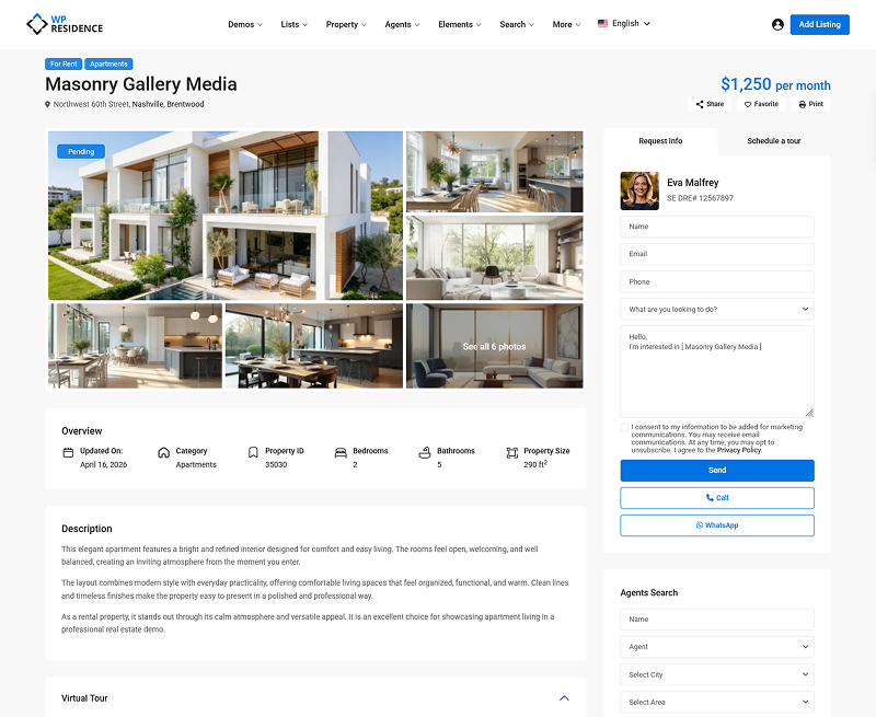
WPResidence Demo -Property page with Masonry Gallery
WPResidence Demo -Property page with Masonry Gallery v2
What Not to Do with Your Hero Gallery
Uploading 40 to 50 photos feels thorough, but it doesn’t speed up the sale. In Zillow’s data, listings with 28 or more photos sold more slowly than the 22-to-27 range, partly because those homes were priced higher. The fix is curation: pick 22 to 27 strong images, exterior shot first.
Why Floor Plans Belong Above the Fold
Floor plans are a primary conversion block in property website design, not a footnote in a “more details” tab. The WAV Group Floor Plan Consumer Interest Survey (August 2025) found 82% of buyers believe the real estate industry should require a floor plan on every listing.
Adoption is climbing fast: floor plans now appear on roughly 1 in 3 new U.S. listings as of October 2025, up from just 2% in 2022 (CubiCasa press release, October 7, 2025). But the majority of listings still don’t have one, so a listing with a floor plan still stands out.
Several figures below come from companies that sell floor-plan services, so read them as directional. Rightmove research, cited by RoomSketcher in 2025, found 1 in 5 buyers will ignore a listing with no floor plan, and 1 in 10 won’t arrange a viewing without one. Floor plans are also reported to be clicked 7.5 times more often than maps (realestate.com.au, via RoomSketcher).
Rachel Gombosch, Marketing Manager at Virtuance, writing on the Virtuance blog in April 2025, puts the case this way: “By providing a clear visual representation of the layout, you empower them to make informed decisions and reduce uncertainty. This builds trust and encourages them to take the next step, whether it’s scheduling a viewing or making an offer.”
So when buyers do reach out, they already know the layout works for them. In property website design terms, fewer time-wasters and more serious inquiries.
Interactive floor plans, where users click rooms to load photos, are reported to generate roughly 60% more views and 79% more saves. A static 2D plan still performs strongly and is easier to publish. Either way, the floor plan sits after the description and before the map, as a large clickable thumbnail that expands into a lightbox.
Both WPResidence and WPRentals support floor plan uploads natively. On your property edit screen, you’ll find a Floor Plans section to upload the image. Display it as a full-width thumbnail with a “View Floor Plan” expand button, not buried in a two-click accordion.
Neighborhood Map: Embedded, Not Linked
Many WordPress theme demos ship the neighborhood map as a “Click to view map” link or a small sidebar thumbnail. That pattern quietly loses buyers. Baymard Institute’s research on property search results found 65% of users never engaged a map hidden behind a toggle, and the same out-of-sight risk applies to a map link buried on a single listing page.
The right pattern for this part of property website design is a full-width embedded interactive map on the page itself, not a link-out and not a tab. A roughly 400px-tall Google Maps embed with pre-loaded layers for schools, transit, restaurants, and parks is the standard used by Zillow, Rightmove, and Redfin. For walkability data, the Walk Score widget is the default.
Good news here: WPResidence supports Walk Score, Yelp reviews, and a Google Maps embed natively. In your property edit screen, you’ll see a Location section where you drop in the address, then toggle the points-of-interest layers (schools, transit, restaurants, parks) so the map loads with the context buyers want.
One performance tip: lazy-load the map iframe so it doesn’t compete with the gallery for load time.
One caveat: Baymard’s split-view research ran on hotel and rental booking sites, not residential MLS searches. The principle transfers because location is still the top factor, but map reliance may be lower for buyers who already know the neighborhood. Embed the map anyway.
Contact-Agent Flow: Where Property Website Design Converts
Every block above exists to get a buyer to one moment: submitting their contact information. The form design decides whether that moment converts, and the biggest lever is field count. CRO research cited by Jamil Academy found 9-field forms convert at 3.6%, while 3-field forms convert at 10.1%.
Baymard’s checkout research points the same way: the average checkout carries 12.8 fields when 6 to 8 is optimal. For a property inquiry form, keep it to three fields: name, email, and phone.
Adding budget, timeline, or financing fields kills the form. You lose some buyer data, but a form people actually finish beats a detailed one they abandon.
Contact-form placement is a core property website design choice, and the right pattern depends on the device. The sticky sidebar is the desktop default; it floats alongside the listing as the buyer scrolls (Zillow, Rightmove, and Domain all use it).
The inline form below the description is the fallback for narrow or single-column templates that have no sidebar. The floating bottom bar is the mobile default: a thin persistent bar with a phone icon and a “Contact Agent” button. Don’t replicate the desktop sidebar on mobile.
CTA copy matters too. “Schedule a Free Tour” beats a generic “Submit” because it names the outcome.
The form should sit next to or inside the agent card, a trust block: a headshot, full name, title or license number, a click-to-call phone number, and ideally a review count. One UX analysis from RevivalPixel found pages with a single clear call to action convert up to 30% better than pages with competing actions.
To set this up in WPResidence, open the theme options and head to the property page settings. You’ll see a toggle for the sticky sidebar contact panel and an option for the number of form fields. Set it to three fields (name, email, phone), and check that the mobile floating CTA bar is on.
Property Website Design for Multi-Property Pages: the Split-View Standard
A single property listing page and a multi-property search results page are two different things. The property page answers “is this the one?” The search results page answers “which one should I look at?” Treating them alike is a common property website design mistake.
One thing first: a small agency page with 12 to 50 listings doesn’t need the full machinery below. A 3-column card grid with a simple price and type filter is plenty. Split view is for portals and large brokerages.
For everyone else, the search-results standard is split view. Baymard Institute tested hotel and property rental sites across 600-plus hours of usability sessions. On list-only layouts, 65% of users never engaged the map; on Hilton’s split view, 95% engaged it immediately.
Sally Collins, Senior UX Researcher at Baymard Institute, described the finding plainly: a split-view layout, with listings and a map side by side on the page, “immediately satisfies users’ desire to understand the exact location” of a property.
Major portals are moving the same direction. In December 2024, Zillow began rolling back its two-tab search experience that separated MLS listings from non-MLS listings. Matt Hendricks, VP of Industry Affairs at Zillow, said: “Consumers want and expect a single-search experience, where all available homes for sale can be viewed seamlessly.”
Each property card should carry only what a buyer scans in a second: a primary photo, the price, the address, a beds-baths-sqft icon row, and a status badge. Leave off school district data, agent contact info, and description text.
A card is an invitation, not a summary. Place filter and sort controls in a horizontal bar above the grid, not a sidebar.
This is where the theme does the heavy lifting. WPResidence’s property card composer lets you drag and drop which fields appear on each card. For a portal-style feel, it also supports a Zillow-like modal that opens a property preview from the grid.
Key Takeaways
- The canonical single-property listing page follows six blocks in order: hero gallery, key facts, description, floor plan, neighborhood map, and contact form.
- NAR’s 2024 buyer survey ranks photos (41%), detailed property information (39%), and floor plans (31%) as the top three features buyers value on real estate websites.
- Zillow research on 2014-2015 listing data found homes with 22 to 27 photos were most likely to sell within 60 days; homes with 28 or more sold more slowly.
- Floor plans now appear on roughly 1 in 3 new U.S. listings as of October 2025, up from 2% in 2022 (CubiCasa); 82% of buyers believe the real estate industry should require a floor plan on every listing (WAV Group, August 2025).
- On multi-property search pages, Baymard Institute found 95% of users engaged a split-view map, while 65% on list-only layouts never engaged it at all, making split view the recommended default.
Frequently Asked Questions
What is the best layout for a property listing page?
The best property website design follows six blocks in order: hero gallery, key facts strip, property description, floor plan, neighborhood map, and contact form. That sequence matches the buyer’s decision path, from emotion through the photos, to qualification through the facts and floor plan, to the conversion action. A WordPress real estate theme like WPResidence ships all six blocks as configurable modules.
How many photos should a property listing have?
Aim for 22 to 27 images. Zillow research on 2014-2015 listing data found homes in that range were most likely to sell within 60 days; those with fewer than nine photos were about 20% less likely to. Good property website design leads with the exterior hero shot, and in WPResidence the gallery slider handles the count for you.
Should the contact form be above or below the fold on a listing page?
Not above the fold. Buyers need to see the property before they’re ready to share contact details, and a form placed too early raises exit rates. The best practice is a sticky sidebar that stays visible while the buyer scrolls on desktop, or a floating bottom CTA bar on mobile; WPResidence supports both, with three fields, so the form stays accessible without interrupting the read.
What is split-view layout for property search?
Split view shows property listings and a map side by side on the same screen, the default used by Zillow, Redfin, and Rightmove. Baymard Institute found 95% of users engaged the map in a split-view layout, while 65% on list-only pages never engaged it at all. WPResidence can produce a split-view grid with a horizontal filter bar above the results.
Build the six blocks in this order and your listing page turns browsers into inquiries instead of bounces. WPResidence ships all six as configurable modules, which is why it’s a strong fit for building a page structured this way. Once your single-property page is solid, here’s what to read next: