Real Estate Web Page Design: A Page-by-Page Blueprint
Last updated: May 21, 2026
NAR‘s 2025 Profile of Home Buyers and Sellers reports 88% of buyers still close with a human agent, while the same report finds 46% of buyers started their search online. Your site works as a six-step handoff: the homepage routes visitors into search, search turns browsers into email-alert subscribers, the property page earns the showing request, the agent bio closes the warm referral, the lead form captures contact info, and a CRM follows up before they forget you.
Good real estate web page design is less about looks than about giving every page one clear goal and removing everything that blocks it. The most common mistake is adding more content when the real fix is cutting it. Solid real estate website design starts with understanding what each page must do, then building nothing else on that page.
Full disclosure: this guide is published by WPResidence, which makes a real estate WordPress theme.
Here are the nine pages this blueprint covers, in the order a visitor meets them:
- Homepage: sends the visitor into search or a conversation.
- Property search page: turns browsers into email-alert subscribers.
- Single property page: earns the showing request.
- Agent bio page: closes warm referrals and ranks for the agent’s name.
- About page: tells the brokerage story and builds brand trust.
- Contact page: catches visitors who weren’t ready to reach out anywhere else.
- Neighborhood guide page: ranks for local searches and converts buyers.
- Home valuation page: catches seller leads from “what’s my home worth” searches.
- Blog / resources hub: builds your local reputation and earns return visits.
To see them at work, browse our real estate website design examples.
The Homepage: Orient and Route
What the homepage must do
The homepage has one job: send the visitor into search or start a conversation within one scroll, not tell your full story. Heroes come in three types: search-bar, value-prop, or hybrid.
Must-have elements
- A benefit-led headline with local detail. “112 families helped in Austin since 2018” beats “Experienced agent.”
- A search bar or property preview grid above the fold on mobile, and one primary button only.
- Below the fold: social proof (star rating, transaction count), an agent headshot, and three to six featured listings.
What goes wrong
Stuffing the hero with a video, multiple buttons, a photo, a search bar, and explainer copy pushes the form below the mobile fold. In one Carrot A/B test, a land-seller site climbed from 259 conversions to 398, a 45.87% jump, just by trimming the hero.
The Property Search Page: Turn Browsers Into Subscribers
The one goal
This page has one goal: turn browsing into someone who signs up for email alerts on new listings. The layout that does it best is the half map page: listings left, map right. It lets a buyer scan results and place them on a map at once, which is faster than a list alone.
What to include
- A half-map split view, with a full-screen map toggle on mobile and marker clustering for dense areas.
- Visible filters (price, beds and baths, property type, neighborhood) plus advanced ones like school district and lot size. SennaLabs reports a client case study where filterable categories and real-time search updates helped users find properties about 30% faster.
- A “Save this search” option with email alerts, which is how the page captures leads.
- Correct MLS disclaimer placement (your IDX provider supplies the text), plus RealEstateListing schema on each card (structured data that helps Google understand the listing; a good real estate WordPress theme generates it for you). PlantAndGrowSEO reports schema can lift click-through rate by roughly 15 to 30%.
The trap
Most real estate WordPress themes now include IDX search built in, so watch the type: an iFrame IDX indexes listings on the vendor’s subdomain, not yours, which hurts your SEO.
The Single Property Page: Earn the Showing
What this page must do
A well-built property page has one job: earn the “Request a Showing” click. Everything on it moves the buyer toward that click, or it’s clutter.
Must-have elements
- A gallery of 20-plus photos with swipe on mobile. Preload the first, lazy-load the rest.
- Above-fold key facts: price, beds, baths, square footage, status, days on market.
- A virtual tour link or embed. Industry figures compiled by PhotoUp put listings with virtual tours at 87% more views, with buyers aged 18 to 34 reported as 130% likelier to book a showing.
- A sticky “Request a Showing” button: pinned to the bottom of the mobile screen, fixed in a desktop sidebar.
- A mortgage calculator, lazy-loaded Walk Score and GreatSchools links, and RealEstateListing plus SingleFamilyResidence schema.
What goes wrong
A button placed once mid-page, no sticky element on mobile, or a gallery that preloads every image and slows the page down.
The Agent Bio Page: Close Referrals and Rank by Name
What it must do
The bio page has two jobs: close warm referrals when a referred prospect runs a credibility check, and rank when people search the agent’s name. Strong agent pages feel like meeting the agent, not reading a resume.
Must-have elements
- An H1 set to the agent’s full legal name, so the page ranks for name searches.
- A professional headshot, plus license number, state, and brokerage.
- Transaction volume tied to specific neighborhoods. “Sold 47 homes in Hyde Park since 2020” beats “experienced professional.”
- Embedded Google Reviews. BrightLocal‘s Local Consumer Review Survey finds that the large majority of consumers, 97% in its latest annual survey, read online reviews for local businesses.
- A booking calendar, current IDX listings and recent solds, and RealEstateAgent schema.
The trap
A generic bio that lists credentials with no market-specific numbers. Mikkel Calmann of TYPZA puts it well: an agent who says “we have sold 127 properties in [area], achieving an average of 99.2% of the original asking price” gives “specific, verifiable evidence that cannot be matched by a general claim of excellence.”
The About Page: Brand Story vs. Bio
What this page must do
The About page builds your brokerage or team identity. It answers “why this firm, not another?”, which differs from the bio page’s “who is helping me?” Both must exist.
Must-have elements
- A brand mission in one clear, non-corporate sentence. “We find Austin families homes they’re still grateful for ten years later” beats mission-statement language.
- A team photo grid, with each photo linking to that person’s bio page.
- A local story: years in the market, neighborhoods served, community involvement.
- Brokerage credentials and awards, plus brand-level stats: total transactions, total volume, average days on market.
Common mistake
Collapsing the About page and the agent bio into one “Meet the Team” page. That page neither ranks for agent names nor tells the brand story properly, so both jobs are lost. Solo agents do this most.
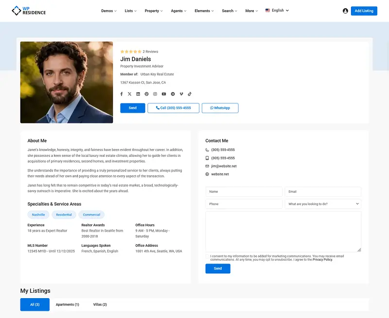
Agent Page Demo on WPResidence
The Contact Page: The Last-Chance Conversion
What this page must do
The contact page is for visitors who weren’t ready to reach out anywhere else. They’re cautious and still researching, so reduce friction and reassure them.
The checklist
- Multiple contact methods: a phone number with click-to-call, an email address, a form, and optionally a Calendly-style scheduling embed.
- A response-time promise in plain terms: “I personally respond within 24 hours, not a robot.”
- A Google Map of your office or service area.
- A short form with three to four fields, and a confirmation message explaining what happens next and when.
Common mistake
A form-only page with no visible phone number and a vague “We’ll be in touch” confirmation. A clear response expectation is what contact pages most often forget.
And speed pays. “The Short Life of Online Sales Leads,” a March 2011 Harvard Business Review article by James Oldroyd and colleagues (using data supplied by InsideSales.com), found responding within five minutes makes a lead 21 times likelier to qualify than 30 minutes. A fast manual reply isn’t realistic, so use a CRM.
The Neighborhood Guide: Your Local SEO Engine
What this page must do
The neighborhood page has two jobs: rank for “[Neighborhood] homes for sale” searches, and convert people already looking to buy there. Those searches signal stronger buying intent than city-level ones.
Must-have elements
- A Quick Facts bar above the fold: median sale price, days on market, property mix, Walk Score.
- Defined boundaries (school zones, MLS area codes) and a housing snapshot: property types, architecture, and 90-day market data.
- A schools section with GreatSchools links. For Fair Housing compliance, describe “best-fit features,” not demographics.
- An IDX widget for active listings, internal links to related neighborhoods and posts, LocalBusiness schema with geo-coordinates, and inline buttons.
What goes wrong
A thin, generic area description with no market data or IDX listings ranks for nothing.
Treat it as a hub instead. Consistent neighborhood content builds organic traffic over time. Neighborhood SEO guidance from ALM Corp points the same way: a cluster of deep, interconnected local pages concentrates topical authority better than scattered posts.
The Home Valuation Page: Catching Seller Leads
What this page is for
The home valuation page catches seller leads through “what’s my home worth” curiosity. A homeowner searching for a valuation is right at the start of deciding to sell.
Must-have elements
- A headline like “What’s My Home Worth?” or “Find Out What Your [City] Home Is Worth Today.”
- A minimal layout: headline, tool, a brief value prop, an FAQ. Nothing else.
- A multi-step form: address first, then property details, then selling timeline, then contact info last.
- Google Address autocomplete on that first field (the biggest friction-reducer) and a final-step button reading “Get My Report,” not “Submit.”
Common mistake
A generic form labeled “Request a Home Valuation” treats the visitor as a form-filler, not a homeowner with a money question.
LeadCapture.io‘s analysis of Zillow’s flow shows why address comes first. Multi-step forms tend to outperform single-step ones, and VentureHarbour reports an outlier case on its own site where switching to a multi-step form lifted conversions from 0.96% to 8.1%, a 743% increase in leads.
The Blog and Resources Hub
What this page must do
The blog hub builds your reputation with Google for knowing your local market, and gives buyers and sellers reasons to return before they contact you. It works as a hub with posts linking in: the neighborhood page is the hub, posts are the spokes.
What goes on the page
- Clear categories: Market Updates, Buying Guides, Selling Guides, Neighborhood Content, Local Lifestyle.
- Internal links from every relevant post to neighborhood hubs and listing pages.
- A “dateModified” schema property on every post (it tells Google when you last updated it), so crawlers see a freshness signal.
- Contextual buttons woven into posts (“Search homes in [Neighborhood]”), email capture, and author attribution linking to the agent bio page.
What goes wrong
Publishing generic city-wide content (“10 Tips for First-Time Buyers”) with no internal links or local angle competes with Zillow and Realtor.com and loses.
Design and Performance Decisions That Affect Every Page
A few choices apply to all nine pages at once. Know the difference between responsive design and mobile optimization: responsive just means the layout doesn’t break on small screens, while mobile optimization means 48-pixel tap targets, click-to-call in the header, a sticky button bar, short forms, and fast loading on a phone.
This matters: NAR’s 2025 Profile of Home Buyers and Sellers reports 70% of home searchers used a mobile device. And since Google completed its transition to mobile-first indexing in 2024, the mobile version is the one Google ranks.
Performance counts for rankings. As Martin Splitt of Google Search Central says, “We highly recommend site owners achieve good Core Web Vitals for success with Search.” INP replaced FID as a Core Web Vital in March 2024 and must stay under 200ms.
On real estate sites, IDX filter dropdowns are usually the slowest interaction, so test them on a phone.
For navigation, keep the top menu to five to seven items and add breadcrumbs on property and neighborhood pages. In the footer, include a Fair Housing statement and license number. For buttons, first-person copy wins: “Find My Home” beats “Search Homes.”
If you’re building on WordPress, a purpose-built real estate WordPress theme like WPResidence handles most of this for you.
Key Takeaways
- Per NAR’s 2025 Profile of Home Buyers and Sellers, 88% of buyers still close with a human agent and 46% started their search online, so the site’s job is the handoff, not the close.
- Simplifying the homepage hero lifted conversions 25 to 55% in Carrot A/B tests; adding content is the top mistake.
- A half-map search layout lets buyers scan listings and place them on a map at once, which beats a list-only view; SennaLabs credits better filters and real-time search updates with cutting search time about 30% in a client case study.
- On the agent bio page, specific neighborhood transaction data, not a credentials list, converts a referred prospect, per Mikkel Calmann of TYPZA.
- INP replaced FID as a Core Web Vital in March 2024 and must stay under 200ms; IDX filter dropdowns are the top risk on real estate sites.
Frequently Asked Questions
What pages should a real estate website have?
A complete real estate website has nine page types: a homepage, a property search page, single property pages, agent bio pages, an About page, a contact page, neighborhood guide pages, a home valuation page, and a blog hub. Good real estate web page design means building all nine to work together.
What is a half-map real estate website layout?
A half-map layout is a split-pane search interface: a list of listings on the left, an interactive map on the right. Click a map pin to see its listing, or hover a card to highlight its pin. It lets a buyer scan results and place them geographically at the same time, which is faster than a list alone.
How many fields should a real estate contact form have?
Keep it to three to four fields. Most tests on real estate lead forms show short forms convert far better than long ones. For a home valuation page, use a multi-step form: ask for the property address first, collect details and timeline next, and capture contact info last.
What is the most important page on a real estate website?
It depends on the visitor’s stage. The homepage routes every visitor, the search page retains browsers, the bio page closes referrals, and the valuation page catches seller leads. No single page is “most important.” Each has one job in a six-step handoff, and a theme like WPResidence that ships all nine pages lets them work together.
You may also want to check out:
- Real estate website design examples to inspire your build
- Our full guide to real estate website design
Nine pages, nine jobs. Build them in this order so each visitor moves from first click to phone call without a dead end. A solo buyer’s agent leans on the search and property pages, a listing-focused team on the valuation and neighborhood pages, but every site needs all nine.