
What Is the Best Real Estate Website Design in 2026?
Last updated: May 22, 2026
Trying to figure out which real estate website design actually earns leads, and which ones just photograph well? The difference is rarely the part that looks good in a screenshot.
Here is the pattern across the best sites: they build emotional desire above the fold, then convert it with a clear call to action or property search just below. No single template produces that result. A solo luxury agent, an island brokerage, and a national tech firm each execute it differently, and all three work.
This matters because your website is doing real work. NAR’s 2025 Profile of Home Buyers and Sellers found that 46% of home buyers said their first step was looking for properties online, which makes your digital front door a revenue asset that must perform both technically and emotionally. Strong real estate website design comes down to five measurable things: where the call to action sits, how images load, what fits above the fold, how many clicks reach a listing, and whether the layout holds on a phone.
What Separates a Great Real Estate Website Design From a Generic One
Most “best of” roundups praise screenshots without saying what they measured. Five evaluation lenses do the work below. Each “Where it works / Where it stumbles” critique applies whichever lenses matter most for that site, so you can run the same checklist on your own.
- Anchor and CTA placement. Where the primary call to action sits (top-right navigation, hero center, or sticky bar) and whether it repeats as the visitor scrolls.
- Image weight and load behavior. Whether photos are served as WebP or AVIF from a content delivery network. The 2025 HTTP Archive Web Almanac (Figure 14.6, Page Weight chapter) puts median desktop image weight at 1,058 KB on home pages, against a total median page weight near 2,862 KB. Luxury sites routinely run past it.
- Above-the-fold compression. How much viewport survives after navigation bars and banners, so a visitor on a 375px-wide phone sees content before scrolling.
- Navigation friction. The count of top-level menu items and the click depth to a listing. Nielsen Norman Group research (2016) found that hiding navigation cuts content discoverability almost in half, on desktop and mobile alike.
- Mobile breakpoint behavior. Whether a hero video falls back to a static image and whether floating CTAs overlap body copy.
No site is judged on all five; each critique calls out the lenses that decide it. The per-site KB figures are the raw HTML document as fetched in spring 2026, not the rendered page, and a CMS can serve somewhat different HTML by region. Treat the numbers as directional discipline signals, not exact measurements or a Core Web Vitals score.
Sandpiper Realty: Selling the Island, Not the Floor Plan
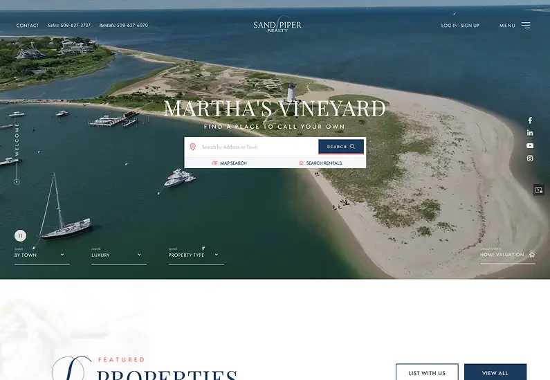
Sandpiper Realty (sandpiperrealty.com) is an independent island brokerage on Martha’s Vineyard, selling since 1969. The hero is a sailboat photo served as WebP from a CloudFront content delivery network, under an H1 reading “Martha’s Vineyard.”
Where it works: the search surfaces one scroll below the fold through “Desktop Rec Searches” tabs (By Town, Luxury, Property Type), so a buyer reaches results in one click. The red, white, and blue maritime palette reads as sailing flags.
Where it stumbles: the fetched HTML document measures about 16KB, light on indexable on-page text, which gives Google’s crawler less to work with in the mobile-first index. The floating “Welcome” anchor link carries no action label, so a visitor cannot tell what clicking it does. The lesson: pair lifestyle imagery with search one scroll down, not buried out of view.
Dwelling in Maine: Brand Voice Baked Into Design
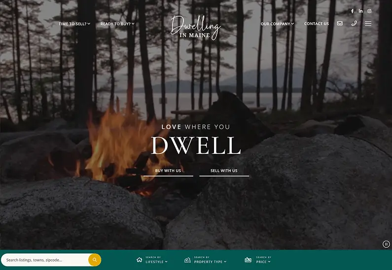
Dwelling in Maine (dwellinginmaine.com) is a boutique independent brokerage in Rockport. The fetched HTML measures about 25KB, the hero contains an MP4 video source element with a flowers photo as the static fallback, and the search tabs below run Lifestyle, Property Type, Price.
Where it works: leading the filter sequence with Lifestyle is a decision, not a default, and it tells a buyer what this brokerage values first. HousingWire describes the deep forest green brand color as carrying “folksy charm,” and the “Maine Owned” copy reads as anti-franchise positioning.
Where it stumbles: an MP4 background video, unless engineered with a static image as the first painted element, becomes the Largest Contentful Paint target, a common cause of LCP above 4 seconds. The HTML shows no preloaded poster frame. A boutique custom build also raises the question of DIY web design vs hiring a professional.
Village Properties: Architecture as Brand Identity
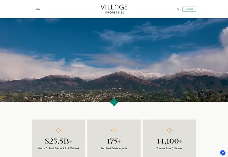
Village Properties (villagesite.com) is a boutique independent brokerage of 180-plus agents in Santa Barbara, built on the Luxury Presence platform. The fetched HTML measures about 80KB, with the hero image on a CDN.
Where it works: the site uses subtle color cues that reflect Santa Barbara’s Spanish Revival architecture, per the HousingWire teardown. Arched image frames on the staff page echo the arched windows of those buildings.
Where it stumbles: eight top-level navigation items with nested sub-menus is a lot to scan, and “Residential Services” alone branches five ways. The IDX search is reached only through Properties, then Home Search, two clicks rather than one.
Carolwood Estates: Navigation as an Access Signal
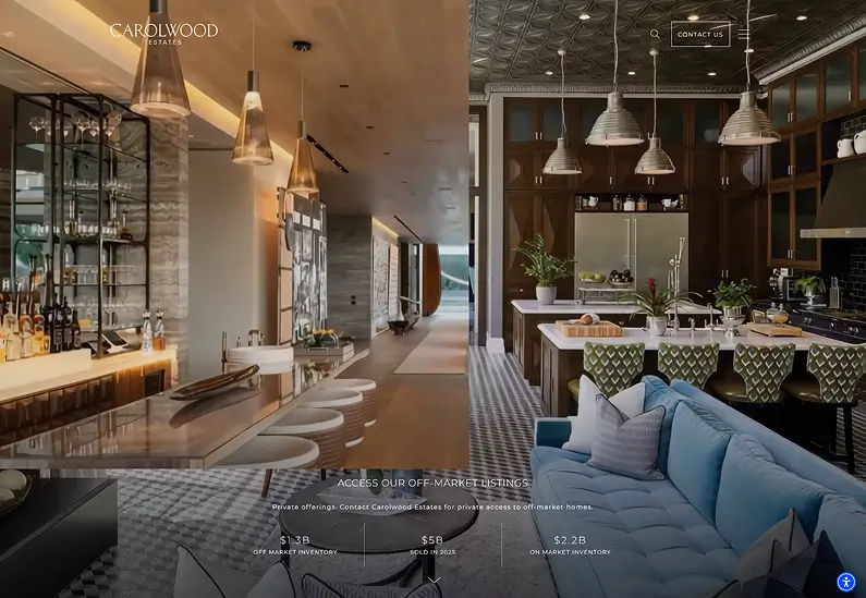
Carolwood Estates (carolwoodre.com) is a boutique luxury brokerage in Beverly Hills, a Forbes Global Properties and Knight Frank affiliate, built on Luxury Presence. The fetched HTML measures about 49KB, with eight top-level navigation items.
Where it works: “Off Market” sits as a top-level item rather than buried in a dropdown, signaling access that competing brokerages cannot advertise. Forbes Global Properties and Knight Frank appear as navigation items, not footer logos. The first content block below the hero reads “Access Our Off-market Listings.”
Where it stumbles: with eight top-level items, the navigation mirrors Village Properties’ depth issue, and reaching a search result means passing four dropdown items before the IDX feed appears. The phone number sits in the header, but there is no persistent CTA for a seller-side lead.
Tracy Tutor: Video Ambition Versus Page Weight
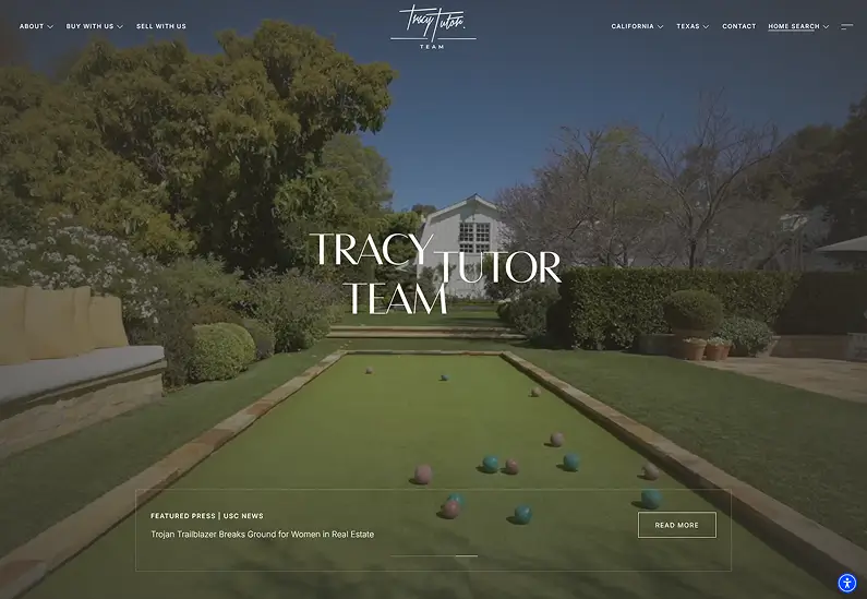
Tracy Tutor (tracytutor.com) runs a high-profile team site across California and Texas on the Luxury Presence platform. The fetched HTML document measures about 166KB, the heaviest in this set, the page references 356 images, and the navigation splits into two horizontal bars.
Where it works: the hero video mixes conference footage of Tracy Tutor speaking to a live audience with drone video of eight-figure properties, so credibility and inventory land at once. Emile L’Eplattenier of HousingWire frames it plainly: “Lead with video.” The two-bar split is a real solution, since an agent in two markets needs both entry points.
Where it stumbles: the page references 356 images, a content-dense build that demands disciplined lazy-loading and WebP conversion. Left unmanaged, that is a real risk to Largest Contentful Paint and INP, the Interaction to Next Paint metric, on mobile. If you want video and good Core Web Vitals together: serve a static poster frame as the LCP element and lazy-load everything below the fold.
Joyce Rey: Designing Every Page for Seller Leads

Joyce Rey (joycerey.com) is a solo luxury agent with Coldwell Banker Global Luxury and more than $6 billion in career sales, on the Agent Image platform. The fetched HTML measures about 71KB and carries AggregateRating schema, a 5.0 score across 8 reviews including one from Lionel Richie. A green floating home valuation widget sits in the lower-right corner of every page.
Where it works: the floating valuation widget makes seller-lead capture ambient, visible on every page without consuming hero space. The structured data lets star ratings and contact details surface in Google results. For more solo-agent layouts, see our real estate agent website examples roundup.
Where it stumbles: the hero now leads with a slideshow of properties under the headline “Over $6 Billion in Real Estate Sales,” but there is no above-the-fold property search bar. A buyer arriving from an organic search for Beverly Hills homes can watch the slideshow but cannot search or filter from the fold. If seller leads are your goal, design every page around a persistent seller-side CTA.
Dora Puig: Achievement Data as the Trust Signal
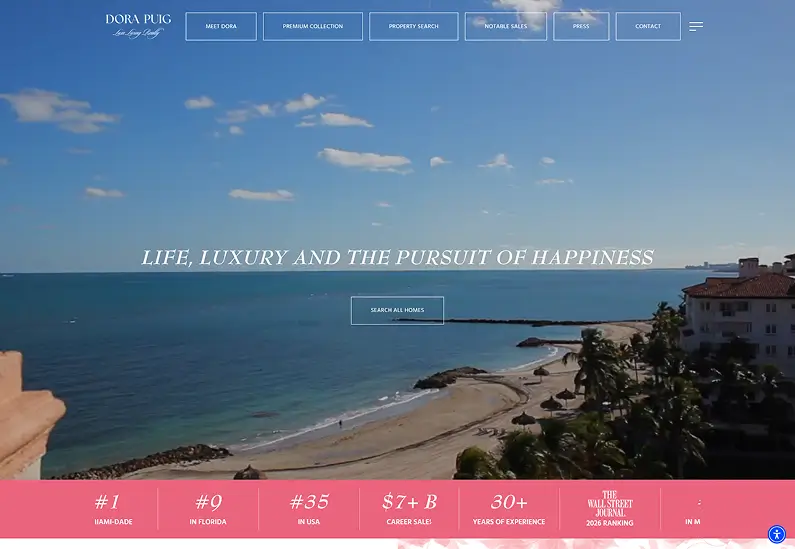
Dora Puig (dorapuig.com) is a solo luxury agent with Luxe Living Realty; the site’s own copy states she ranked #1 in Miami-Dade from 2017 to 2023. The fetched HTML measures about 82KB and the page carries 59 headings, 158 links, and 112 images, the most content-dense homepage in this set.
Where it works: the title tag reads “Luxury Real Estate Miami | Dora Puig, #1 Miami Beach Agent,” so the achievement anchor shows in the search snippet before a visitor clicks. The 59 headings give Googlebot substantial text to index, an advantage over thin JavaScript-rendered real estate agent websites.
Where it stumbles: 112 image references on one page raise the same lazy-loading discipline concern as Tracy Tutor’s build, especially on mobile, unless WebP conversion and lazy loading are in place. Achievement data earns trust when it is specific, a rank, a year, a geography.
The Oppenheim Group: Navigation Built for Three Visitor Intents
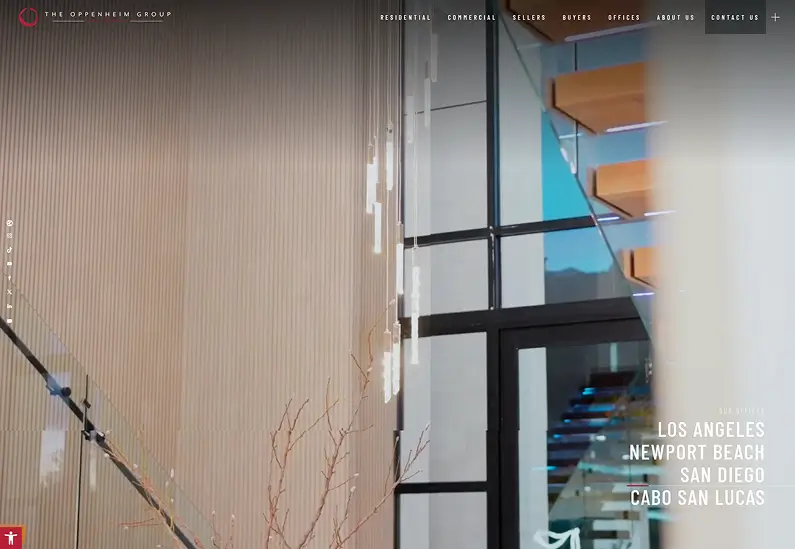
The Oppenheim Group (ogroup.com) is a boutique luxury brokerage in Los Angeles on the Agent Image platform. The fetched HTML measures about 67KB. The top-level navigation has seven items: Properties, Buyers, Sellers, Offices, About Us, In The Media, and Contact Us.
Where it works: the seven top-level items split cleanly into property actions and brand or media, keeping the menu legible. The site still surfaces its Selling Sunset connection, nested under Sellers, then Our Marketing, rather than as a top-level tab. An interactive map for browsing nearby listings, documented by HousingWire, gives buyers a spatial search a search-bar-only IDX cannot match. For more platform-built site examples, see our clients showcase.
Where it stumbles: the hero uses moving images of luxury homes, documented by HousingWire, which can become the LCP element depending on implementation. The Open Graph image is served as PNG rather than WebP, one place where format optimization does not reach. Navigation labels can serve several visitor intents at once, as long as they map to real user goals.
Compass: Utility-First Design and the Best Real Estate Website Design Trade-Off
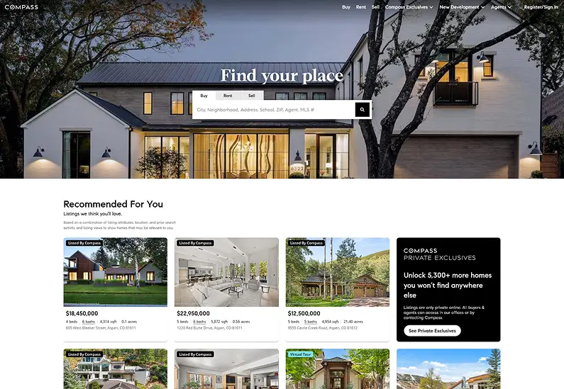
Compass (compass.com) is a large technology-driven brokerage with a custom design, named “Best Brokerage Website” by South Florida Agent Magazine in 2025. Detail here comes from search results, not a fetched page.
Where it works: the hero is a prominent search bar, which makes buyer intent explicit. The monochromatic palette of gray, white, and black removes visual noise that competes with property photography. The “Collections” feature, a Pinterest-style curation workspace, lets buyers share shortlists with their agent without exporting to email.
Where it stumbles: the platform brand dominates agent identity. For a referral-driven business, a Compass page offers no differentiation from any other Compass agent. eXp Realty makes the opposite choice, leading with aspirational slogans, not a search bar. Utility-first design is right for high-volume traffic and wrong for low-volume markets. The best real estate website design you can build is the one that matches your business model.
What the Best Real Estate Website Designs Share
Across these nine sites, five transferable principles hold up, each pointing to a named site as evidence.
1. They sell a life before they sell a listing. Sandpiper’s sailboat hero and Dwelling in Maine’s forest green answer the buyer’s question, “Is this place for me?”, before any property appears on screen.
2. They surface the search where the intent is. Sandpiper surfaces its tabs one scroll below the fold; Compass puts the search bar above it; Carolwood pushes search two clicks deep because its buyers call first. The pattern follows the business model.
3. They use navigation to signal, not just route. Carolwood’s “Off Market” item communicates exclusive access; Joyce Rey’s click-to-call header signals a relationship-first business.
4. The lead-capture mechanism is sitewide. Joyce Rey’s floating valuation widget works because it appears on every page, so a seller browsing listings can still trigger it.
5. They choose one performance risk and manage it. Carolwood at about 49KB and Sandpiper at about 16KB keep their HTML lean. Tracy Tutor runs the boldest bet, a video-first homepage. Its ~166KB HTML document and 356 image references are only discipline signals; for that kind of site the real cost is the video bytes and their LCP behavior, which the bet only pays off with rigorous lazy-loading.
Three of the nine sites run on Luxury Presence and two on Agent Image, so some design similarities are platform defaults, not coincidence. The read-aloud accessibility widget on The Malibu Life, documented in the HousingWire teardown, shows what a platform adds when the owner asks, useful given NAR puts the average seller age at 63. As Tracy Tutor has framed it via Luxury Presence, a well-designed website is the foundation of lead generation, not a trade-off against it.
Observations current as of May 2026.
Key Takeaways
- NAR’s 2025 data found 46% of home buyers said their first step was looking for properties online, so a real estate website is no longer optional infrastructure.
- Nielsen Norman Group research (2016) found hiding navigation cuts content discoverability almost in half, on desktop and mobile alike, so avoid hamburger menus above mobile breakpoints.
- Google finished its multi-year rollout to mobile-first indexing in mid-2024, a shift that began back in 2016, making mobile content parity a ranking requirement, not a recommendation.
- A floating CTA that appears on every page, like Joyce Rey’s home valuation widget, captures leads a homepage-only form cannot.
- A video hero that becomes the LCP element will push load past Google’s 2.5-second threshold unless a static poster frame loads first.
Frequently Asked Questions
What makes a real estate website convert visitors into leads?
A converting site places its primary call to action where the visitor’s eye lands first, a search bar for high-intent traffic or a phone or valuation widget for referral traffic. That call to action should appear on every page. The best real estate website design treats lead capture as a sitewide mechanism, like Joyce Rey’s floating valuation widget.
How many clicks should it take to reach a property listing?
Two clicks or fewer from the homepage is the functional benchmark, one to a search results page and one to a listing detail. Every extra click loses users. Sandpiper Realty surfaces results in a single click; Village Properties requires two, through the Properties dropdown and then Home Search.
Does a luxury real estate website need a fast load time?
Yes. Google’s LCP threshold for a “good” score is 2.5 seconds, and luxury sites with heavy photography frequently exceed it. The fix is CDN delivery, WebP image format, and a static poster frame as the LCP element. Carolwood Estates, at about 49KB of HTML, suggests lean code and rich visuals can coexist.
The best real estate website design is the one that matches its business model. A solo agent’s referral engine is not built like an IDX-first buyer lead machine. Copy the wrong model and a beautiful site still fails to earn leads. If you are planning a rebuild, start with our guide to DIY web design vs hiring a professional. The right site earns leads while you sleep, because it was built for the visitors you actually have.